A-Z Food Photography Project – L is for Lime
I have never struggled as much as I did with this stupid letter. I have reached L is for Lime in the A-Z Food Photography Project. This one was no fun.
Let’s start with a few facts. L is a boring letter. Not that many foods start with L. Cutting limes can be hard. Cutting liquorice is even harder. I hate liquorice. Let’s see how things went in the making of L is for Lime.
L is for Liquorice – first try
The original idea for this letter was to make a super cool L using a gothic font and shaping it out of various pieces of liquorice. I tried that for the bigger part of an evening and as it turns out it is more or less impossible to cut liquorice into a cool looking gothic L. At least if you want it to look decent.
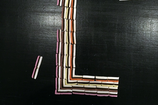
L is for Liquorice – second try
So instead i thought about using the natural lines in some of the pieces of liquorice and using that pattern to make a really cool L. That took another few hours and the result was seriously ugly.
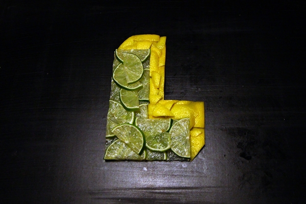
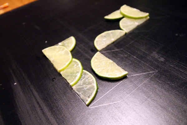
L is for Lime – first try
So now I gave up on liquorice. Let’s go for my good friend lime instead. Limes look cool and actually taste good. I started to make a design more or less like the first letter I made. The A is for Apple. I made it and once it was done it just felt to similar. If I am going to make all 25 letters they can’t all be more or less the same. Also it didn’t look good enough.
So maybe I can do a more three dimensional letter. So I made another not that great looking L out of limes and then added lemon skins to make it look cool. It didn’t.
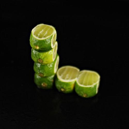
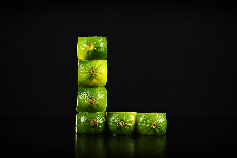
L is for Lime – second try
Now that was the process. Now we are talking about what is actually in this letter. I changed some things up and went for whole limes instead. And instead of cutting them into slices I cut away the sides and placed them on top of each other to shape the L. I also went back to a black background because I haven’t used black for a few letters now.
What I used
If we leave out all the failed tries this is what I used for the L is for Lime.
- 10 limes (a few extra)
- knife
- camera
- black background
- black board to place the limes on
- 2 softbox lights
- tripod
- water
- patience
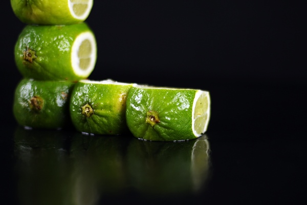
After cutting the limes I placed them on top of each other. I used a black painted board to place them on. Then I sprinkled them with water to make them shine a bit more. As a background I used a black fabric. Two softbox lights that was set one on each side and then I took the photo from the front. Not very complicated at all.
Next letter will be M. Let’s see what I come up with then.

About A-Z Photography Project at Ateriet
A-Z Photography Project is a photo project here at Ateriet and at Instagram. The idea is to photograph each letter of the alphabet and let it represent one food or something edible. I am making the project for fun and to hopefully improve on my photography skills.
You can follow the project on Instagram under the tag #atozinfood where some of these photos will be published from our Instagram for Ateriet that you’ll find at @AterietFood.
Feel free to share and contribute and come with critique about this project, just send us an email, leave a comment or connect on social media.